Not everyone with a smile means well
Industry
Property management
Outcome
Banking
Role
Product Designer
Duration
2 months
Tools
Lyssna, Chat GPT, Figma
context
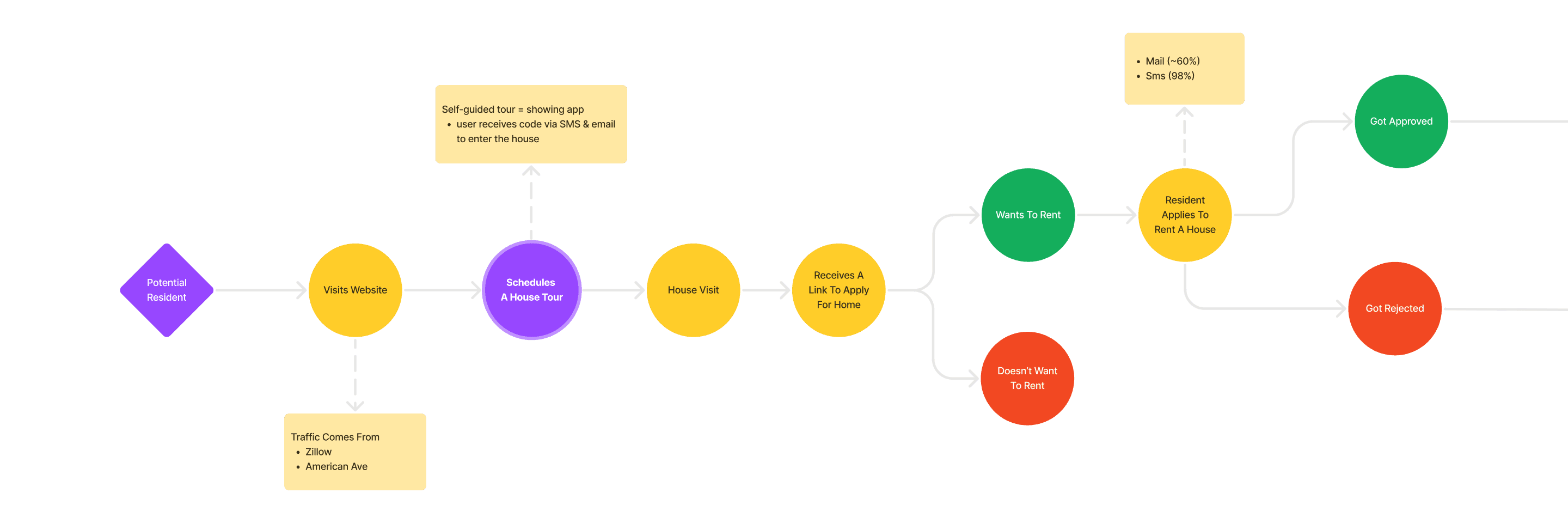
Let’s view your next home
America Ave mission is simple: Affordable Homes For America!
Wanna see a house nearby? Just choose a date & time and we will text you the tour details. Like a door code, generated just for you for this time. Sounds simple, doesn’t it?
problem
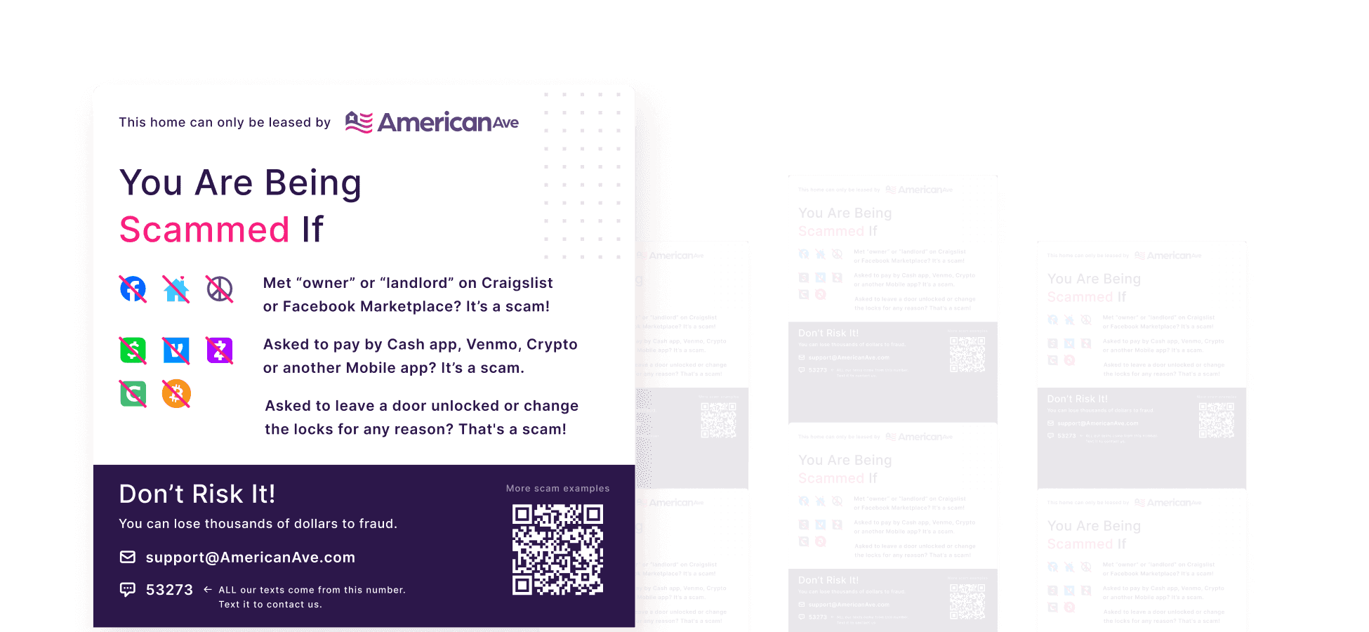
Test Your Scam Radar
Unfortunately, scammers are everywhere. They steal photos of our homes and post fake listings on Facebook, Zumper, or Craigslist. Pretending to be landlords, they use your phone number but click through our app themselves. Some ask you to leave the back door open “for the cleaning crew.” The scams keep evolving, but the goal stays the same: to vanish with your money — sent through apps like Cash App, Venmo, or even in bitcoins. Some of our applicants learned that the hard way. And with every scam, that hard-earned trust gets a little shakier.

solution exploration
Solutions
With the scammers problem growing, the whole company was challenged to take action. I was responsible for the design work across these key initiatives:
Avoid Scams website
Educating potential residents on how to avoid being scammed out of thousands of dollars at different stages of leasing a house.
Neighborhood Watch
After move-out inspections, field workers introduced the company to the neighbours, leaving door hangers when no one was home. These included information on reporting concerns, requesting maintenance, and checking availability for interested friends or family.
Anti-Scam Sticker
Stickers informing applicants about potential scams were placed near front & back doors, as well as inside the fridge in every home.

Anti-scam sticker - on the left, with neighbourhood watch door hangers.
Many versions later
‘Design preferences’ dylema
We went through multiple anti-scam sticker versions, shaped by feedback from key stakeholders. One even leaned heavily into “more text, less visuals” approach. But in the end, what counts as a good sticker? And how to measure success?
The Challenge
Design reviews were a loop. We kept going back and forth, unsure if the stickers would actually do their job.
The Aim
Will applicants notice them?
Will they stop and read?
What will they remember?
Success Metrics
Spotting sticker during house tour (aka self-showing)
Listing scam examples
Knowing how to reach out to us (American Ave)

Testing Proposition
Contextual research
The best approach? Natural environment.
The issue was, self-guided tours were scheduled at random times, and no-shows were a factor. Plus, the plan was costly.

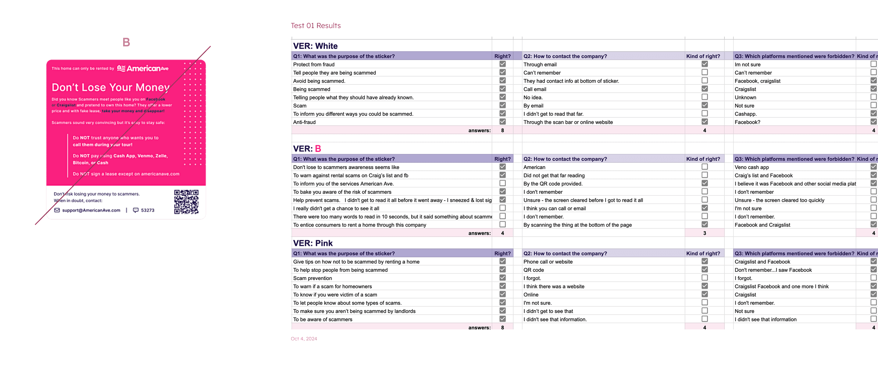
Test 01
Five second testing
A natural environment would have been ideal, but to avoid overspending the budget, we needed to work with real residents, tempted by the offer of an Amazon voucher. Or, at the very least, people who were very similar to our tenants..
First, we tested 3 different variants, including one with a lot of text (B). The sample size was small (8 people per version) to get familiar with the tool. It was important to assess whether the questions were clear and to understand the type of data the testing tool was gathering.
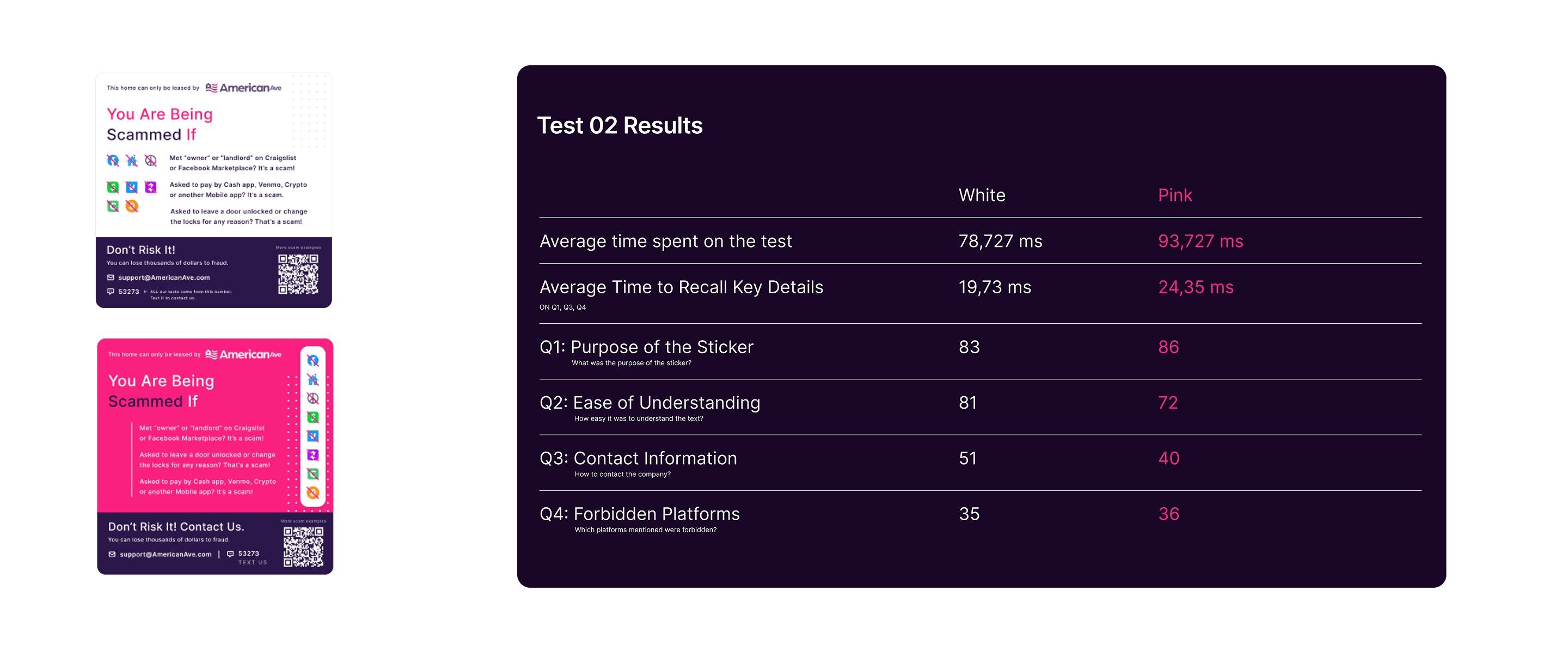
test 02
Final battle
Down to 2 options, both the pink and white versions had their supporters and opponents within the company. This time, we tested with 100 people per version (sample size).
Participants were asked to view an image (one of the stickers) for 10 seconds and answer a few simple questions, such as:
What was the purpose of the sticker?
How easy it was to understand the text? +added
How to contact the company?
Which platforms mentioned were forbidden?
Are you excited about the results, the same way I did?
Summary
How to analyze 200 responses super fast?
From that day Chat GPT is my friend. Our relationship is not always full of roses, but hey, as UX assistant it is doing a very good job. Plus it learns fast.
Ladies and gentlemen, you may not even like it, but the white version is the winner. The pink one might catch your attention more, but the field workers mentioned that the original pink stickers looked very similar to red alerts from a distance. Leading some to feel they resembled an "don't come closer" sign.