Bringing clarity across banking, insurance, and legal tech
Bringing clarity across banking, insurance, and legal tech
Bringing clarity across banking, insurance, and legal tech
Stage
Maturity & renewal
Stage
Maturity & renewal
Industry
Banking, Insurance, Legal
Industry
Banking, Insurance, Legal
Timeline
Jan 2022 – May 2024

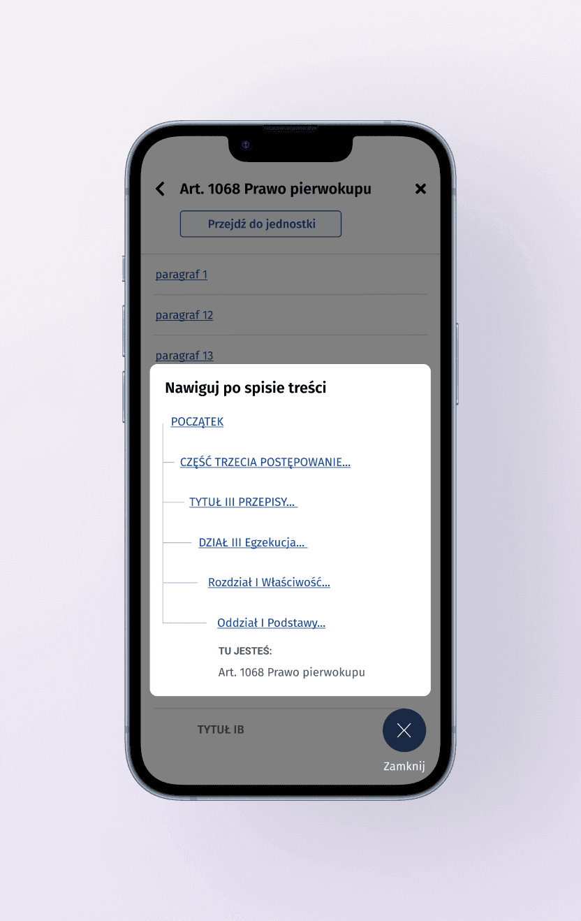
Legal
Accessible legal platform
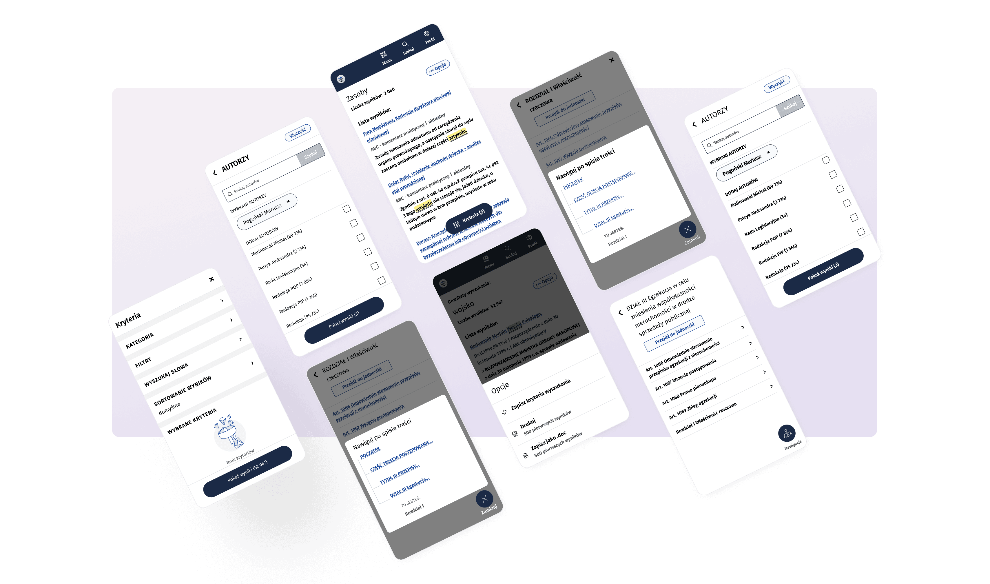
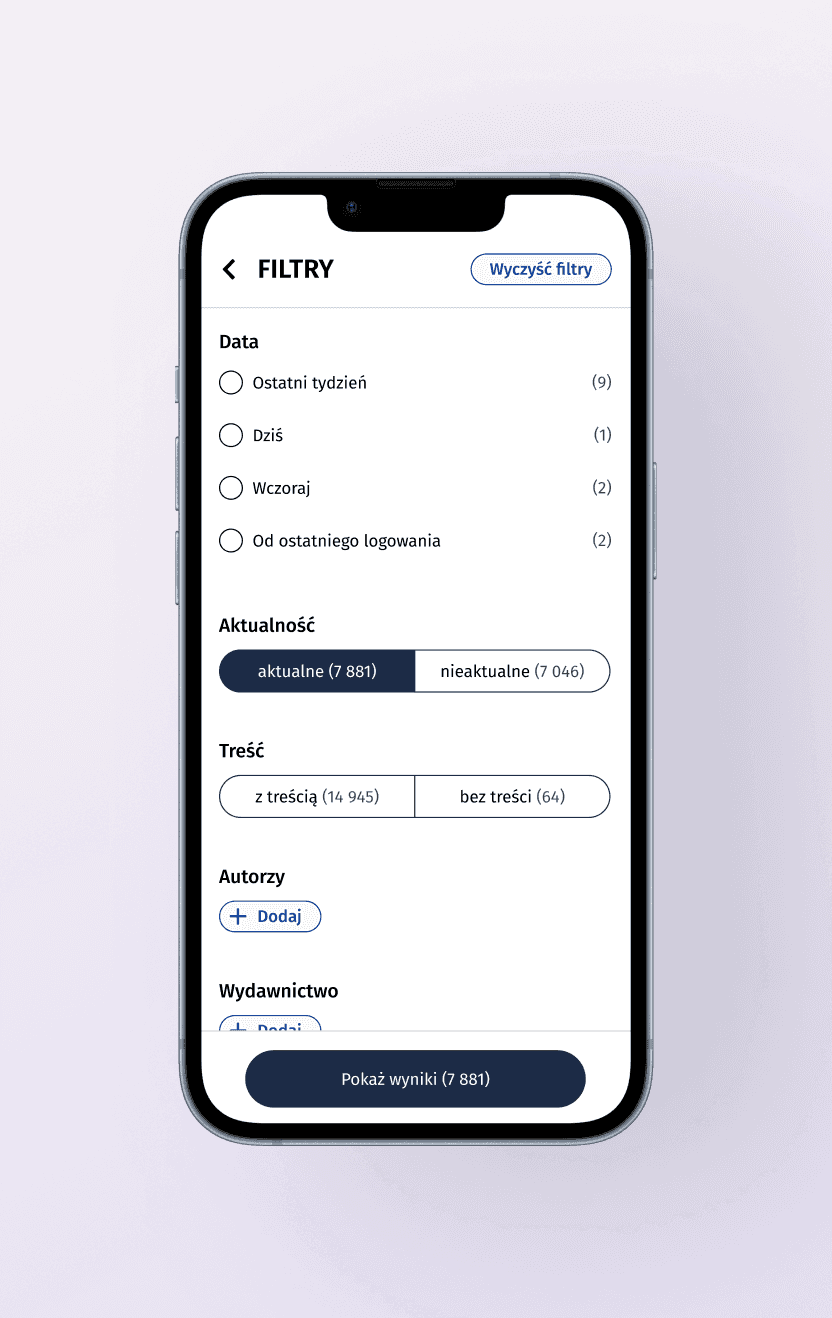
One day, one of our regular customers asked us to help with a redesign.
Their web-based platform had grown organically over the years, resulting in a dense interface overloaded with features. Our task was to redesign selected views for the target group, who prefer stability.
How to change an interface that doesn't like change?
It was certainly not an easy task. We approached it iteratively.
The main goal was to
Improve usability for a change-skeptical user group
Align with WCAG 2.1 AA accessibility standards
Prepare the product for usability testing with real users
Challenges
Long-term users resistant to interface changes
Overloaded UI due to accumulation of features, including lack of clear navigation structure
Working closely with Accessibility Expert ensuring WCAG 2.1 AA compliance across redesigned views with many functionalities for web & mobile
My Impact
During the design process, there were cases where I designed three solutions, ranging from the most to the least intrusive to the product. The end result was then tested with client’s trusted focus group.
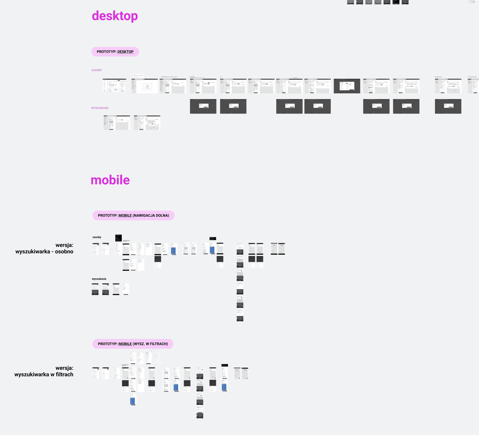
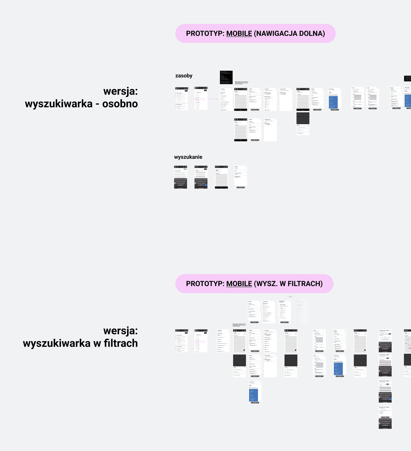
Delivered over:
140+ wireframes
19+ interactive prototypes
40+ pixel-perfect screens
Conducted bi-weekly review sessions, that minimize the time needed to make decisions with enough time to show the progress and discuss the most controversial issues
To support orientation within complex navigation we introduced a mega-menu & breadcrumbs to support features used the most, based on Google Analytics data.
Legal
Accessible legal platform
One day, one of our regular customers asked us to help with a redesign.
Their web-based platform had grown organically over the years, resulting in a dense interface overloaded with features. Our task was to redesign selected views for the target group, who prefer stability.
How to change an interface that doesn't like change?
It was certainly not an easy task. We approached it iteratively.
The main goal was to
Improve usability for a change-skeptical user group
Align with WCAG 2.1 AA accessibility standards
Prepare the product for usability testing with real users
Challenges
Long-term users resistant to interface changes
Overloaded UI due to accumulation of features, including lack of clear navigation structure
Working closely with Accessibility Expert ensuring WCAG 2.1 AA compliance across redesigned views with many functionalities for web & mobile
My Impact
During the design process, there were cases where I designed three solutions, ranging from the most to the least intrusive to the product. The end result was then tested with client’s trusted focus group.
Delivered over:
140+ wireframes
19+ interactive prototypes
40+ pixel-perfect screens
Conducted bi-weekly review sessions, that minimize the time needed to make decisions with enough time to show the progress and discuss the most controversial issues
To support orientation within complex navigation we introduced a mega-menu & breadcrumbs to support features used the most, based on Google Analytics data.
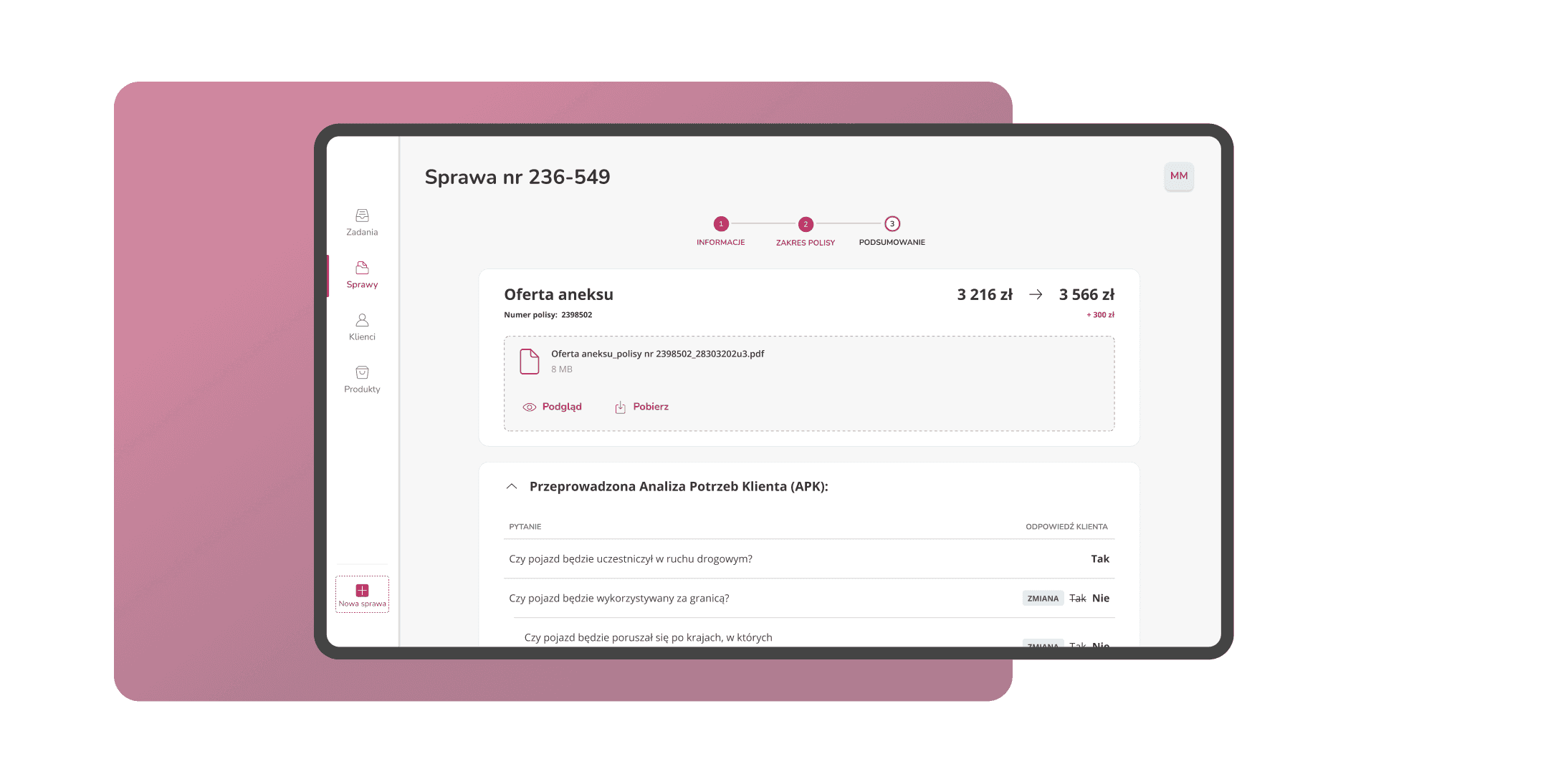
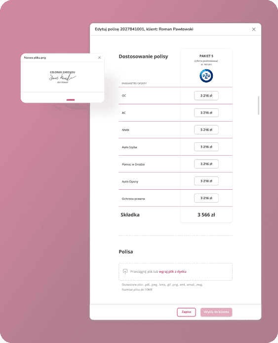
Insurance backend system
Less errors for insurance ops
Client
An internal system for a financial-sector client with many stakeholders, from IT teams to banking specialists. Project focused on insurance backend system.
Goal
Reducing the number of errors made, especially by new internal employees.
Our Approach
We kicked off with interviews with both internal users and stakeholders across different departments to quickly get a solid grasp of the system. Working closely with the Lead UX Designer, we mapped out priorities in a series of workshops, translating them into clear design directions.
How we made it work
Delivered daily iterations with BA, for a team of 5 stakeholders from different departments
Present research outcomes and design propositions to stakeholders, including dev team to align business goals, user experience & tech constrains
Reduced design-to-dev handoff by adding Jira ticket numbers next to Figma screens

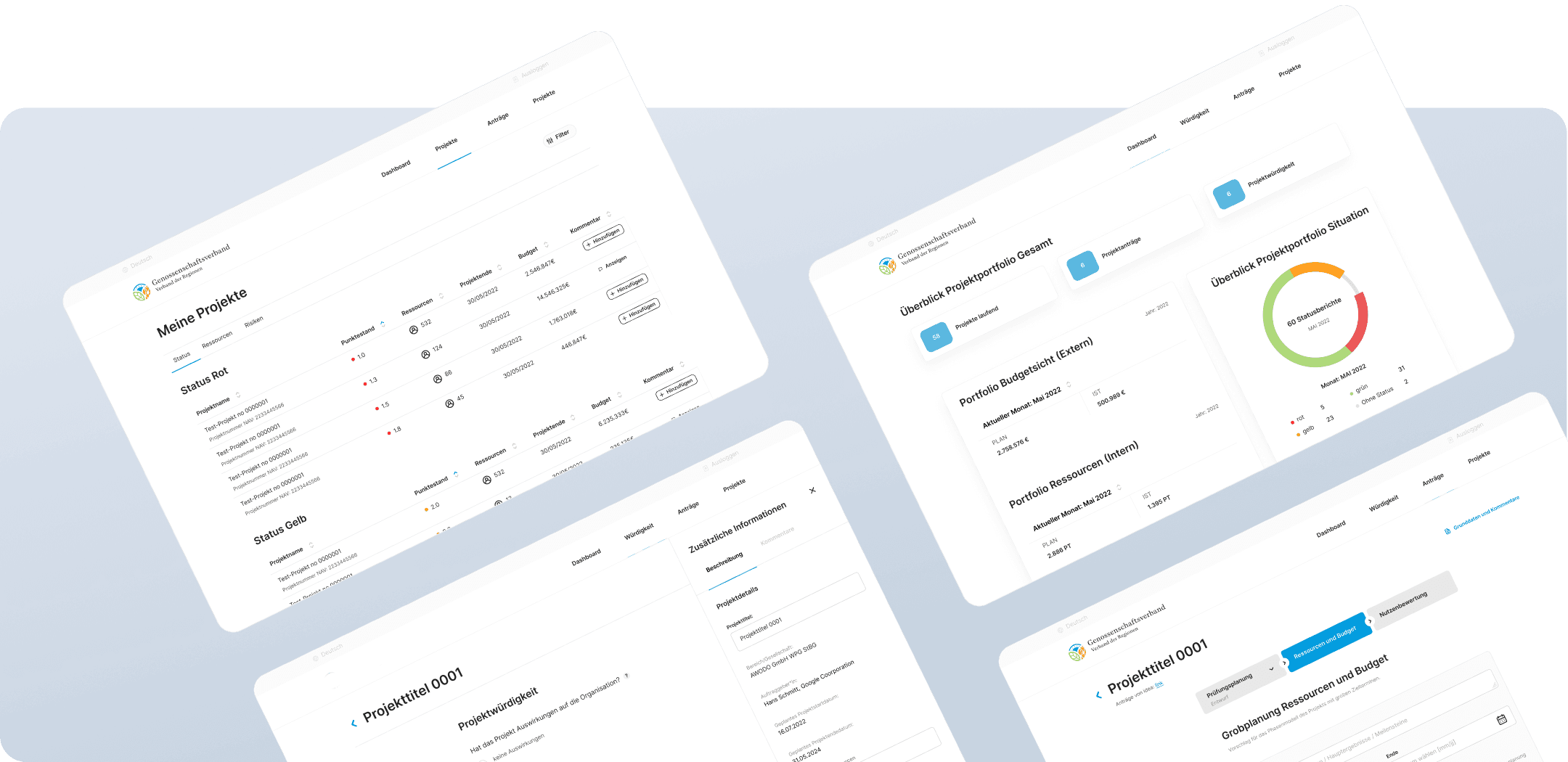
Cooperative Banking
From idea to investment
Client
A large cooperative association in Germany, bringing together 358 credit cooperatives and over 1,500 employees.
Goal
Build a tool that helps calculate project worthiness based on internal audit guidelines. In short: automating the process saving time and money.
Our Approach
With just two sprints and one kick-off (= ~2 weeks) a Business Analyst and I turned rough sketches into high-fidelity mockups. The challenge? Navigating complex Excel logic and strict audit rules, all while aligning with a design system managed by another team.
How we made it work
We extended the existing design system used across the client’s ecosystem, keeping visual and UX consistency without slowing things down.
Get in touch
Local time in Gdańsk, Poland
🇵🇱 🇪🇺
© 2025 Fembot Studio 👾 by Zuzanna Adamczyk. All rights reserved.
Get in touch
Local time in Gdańsk, Poland
🇵🇱 🇪🇺
© 2025 Fembot Studio 👾 by Zuzanna Adamczyk. All rights reserved.
Get in touch
Local time in Gdańsk, Poland
🇵🇱 🇪🇺
© 2025 Fembot Studio 👾 by Zuzanna Adamczyk. All rights reserved.